
Senior design project


Protect your Magic
This project was centered around raising awareness on the impact that social media is having on the upcoming generation of girls. A girl's confidence needs to be protected in a time where getting likes on Instagram seems like the most important thing in her life. My goal was to create a conversation about the issue through a combination of striking quotes and bright, bold colors. The text animation was designed to point out the important points made throughout the video as well as the girls' shocking quotes about social media. I hope my campaign can serve as a jumping point for young girls to talk about how social media is impacting them psychologically, and what can be done to improve it.
digital
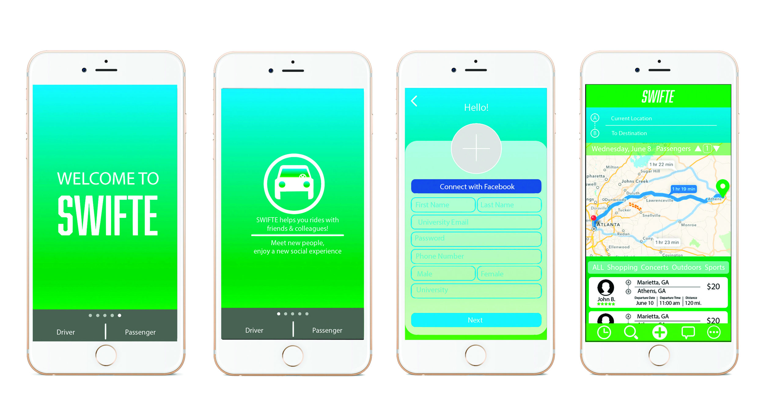

Swifte App Design
Swifte is an mobile carpool app for college students to give and provide rides to other students. Co-designing the app with a fellow design-classmate, we worked alongside the creator of Swifte to make sure we included every function she imagined that app would have. As designers our goal was to build a simple, but engaging design that would encourage users to use the app. As it is geared for college students we chose a fun blue and green gradient color scheme to appeal to the younger audience. There is an icon for every function of the app located at the bottom tool bar and are always visible for easy access when trying to catch a ride. Our wireframes were sent to developers and the Swifte app is now available on the Apple App Store!
Branding


Personal Logo
As a young graphic designer, creating a personal logo is an exciting project to tackle! I came into the project knowing I wanted the logo to have a strong typographic feel. With that in mind, I experimented with a variety of fonts and layouts using my last name. I chose a sans serif font with sharp lines that would give a strong essence to the logo. The final design was created by stacking my name so it was still legible, but interesting to look at. From there I altered the original font in a way that created conversation between top and bottom letters.


Bundle of Love Ultrasound Studio
Bundle of Love is a startup 3D ultrasound studio company based in Charlotte, NC. As a new company, they didn't have a clear idea of the look or feel they wanted the company branding to have. With a blank slate, I was excited to tackle this project to help them create a brand that accurately represented the company and would appeal to potential clients. After many sketches and phone calls, I ultimately created a soft color scheme paired with a clean graphic and typeface to portray the gentleness and cleanliness of the office and care of the technicians. I was able to nod at the purpose of the studio through the safety pin "B" graphic. The combination of elements added up to a simple and balanced logo that the new company was excited to implement!


Restaurant Brand and Menu Design
This was a project for one of my classes where we were to create a hypothetical restaurant and brand it. Following my love for guacamole, I chose to brand a Mexican restaurant. I came up with Carnita Cantina, a modern, fresh, Mexican cantina. I experimented creating different patterns based on traditional Mexican patterns and shapes. The final pattern was then applied to the cactus shape and combined with the “Carnita Cantina” name. The menu pattern is a rendition of a wood texture but with a cleaned up, fresh flare. The monochrome color scheme combined with the various patterns work together to create the authentic, but modern Mexican theme.
publications and print


Food Magazine
This was a project for one of my senior graphic design classes. Our assignment was to create a mini magazine of whatever topic interested us. I chose to create a food magazine because I wanted to utilize my photography skills and physically photograph the awesome food I would feature in the publication. My goal was to create a cohesive aesthetic between the photography, layout design and content. Going for the healthier food theme, I chose a soft color scheme with pops of rich color from certain food ingredients or other elements in the photographs. I designed crisp, simple layouts to display the content so the reader would be able to easily find and read the recipes featured in the magazine if they were cooking them in their own kitchens. I enjoyed working on this publication because it gave me the opportunity to control every aspect of the design and create an aesthetically pleasing and useful magazine.


Beyonce Formation World Tour
These Beyonce World Tour Posters were inspired by my love of Queen B. The Lemonde Album has more of a serious message than her previous albums so I wanted to carry that tone throughout the poster’s imagery. Combining strong text over the strong image of her face creates visually seductive imagery that draws the viewer into the poster. The color variations are inspired from the Lemonade video album color scheme which combined black and white footage with blue and yellow tinted footage.